I’ve actually been planning out this post in advance, and I have been photographing my progress at every step.
Our first project was a large picture of a whole bunch of stuff that either describes who we are, or is stuff we like. The first part of the assignment was to make a mind map. Basically we were to write down everything we could think of that we liked, or that described us, and then choose 20 words. This is what it looked like when I was done.

I could have done more, and I was undecided about what 20 words to choose so I pretty much gave up on it and wrote a separate 20 word list of stuff I thought I’d like to use for a picture. The next assignment was to design a picture using those twenty words together to make a cohesive piece of art. I don’t think I used my whole list, and I added some stuff that wasn’t on my original list, as well as took some creative liberties with a few of the words, but I had an idea, and I didn’t want a bunch of random stuff “Floating” in the empty spaces of the picture. Our teacher had shown us some examples of a few of his best students’ work from past classes, and as good as they were, a lot of them just seemed to be random objects floating around one main object. I wanted something more organized. The only problem was I had two words that I wanted to use, but I didn’t know how to incorporate them. Bible, and pizza. Neither of those would fit into this piece of art, but I felt that at least Bible needed to be there, and I really wanted pizza, because, well, I just love pizza.
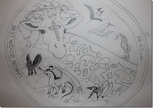
The main thing I wanted the drawing to be about was art and photography. Because that, in a nutshell, is who I am. I also knew that there had to be a giraffe in it. Once I got the idea that the picture would be of a camera focusing on a giraffe, everything else fell into place. I dropped the “Art” aspect because there wasn’t a good way to fit it in, and this was art in itself, so it was kind of a given that I loved art.
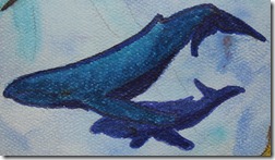
One of my categories in the mind map was ocean life. I decided that instead of doing a sky, I’d make it an underwater scene and use a bunch of my favorite sea creatures.
For the background I was just going to do a bunch of my favorite animals, like an okapi, and a horse, but I also really wanted to do a dragon, so I decided that instead of doing real animals, I would do made up ones. They’re even more fun to draw than real animals.
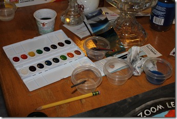
Unlike our Drawing 1 class we will be using color in drawing 2. For the last step he gave us each a set of watercolors, and paintbrushes.
I have never painted with watercolors before, other than when I was a little kid and had no idea how to use them. Our teacher showed us how to use the paint and mix it if we wanted to. He also gave us tips on how to get better results than just straight up painting. I had a lot of fun working on this.

I was mostly happy with how it turned out, but there were some things that needed fixing. Our teacher had said we did not HAVE to use the watercolors, and said we could use anything we wanted, as long as we turned in a full color drawing. So I went to work with my colored pencils, markers, and pens, and played Photoshop-in-real-life, until I got some better results. For the most part it is unchanged, but if you look close you’ll see many minor changes all over, mainly in shade and color, plus I got rid of a few spots where the paint had smudged.

To help you see some of the differences I took some detail shots as well, so I can show you side by side how things changed.
First we have my giraffe. The main thing I wanted to do was add detail, because it was the main focus of my picture. As you all know by now, I love giraffes.
Next up, my Manta Ray. I didn’t change anything on him, but I needed to clean up some smudges around him. When I was looking for reference photos on the internet to use, I searched Ray, not specifying Manta. Google apparently thought I wanted Rachel.


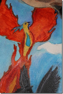
Next is my Pegasus. When I was making my list, I had the words Horse and Fantasy. I decided I would mix the two instead of doing them separate. When fixing the Pegasus I added a bunch of details that had disappeared during painting. Painting something jet black doesn’t allow for details to show through. I finally found a use for the white colored pencil! Notice also the changes in the areas surrounding him. I changed the shade of the bottom of the mountain in the background as well as the dirt in the cliff under the Pegasus. I also added detail to the grass and cleaned up a whole bunch of unsightly black smudges.
Well, that’s all for now. I just looked at the time and it is about the time I would be leaving school, so instead of spending the afternoon in art class, I spent the afternoon blogging about art class.

